Knocking your head against the wall to figure out the perfect color scheme for your wedding or special event? I’m the type of person who likes to take risks, but still tends to be a bit traditional when it comes to color. One of the best color schemes for the traditional risk taker is neutrals mixed in with a pop of neon.
Neon…yikes! You may be telling yourself this, but hear me out. Neon can be played up or down in a color scheme. It is a great way to please the mother of the bride but still allows for a younger, brighter personality to come through.
A couple of years ago, I had the pleasure of designing with a neon color scheme. Check out Audrey and Erics wedding invitation by clicking here. The parents of the bride and groom were very traditional. They were also helping to pay for a big portion of the wedding. If that’s the case, you need to respect a little of what they say, but don’t lose yourself in the process. Find the happy medium.
For this particular couple, the happy medium was a traditional pattern on a gray paper with a pop of canary yellow. This was one of two proposed designs and I thought for sure that the mother of the bride was going to hate it. Boy was I ever wrong. The bride and mother of the bride were both happy. They each thought they had won the wedding color scheme battle.
It’s a hard process to come up with the perfect color scheme for your big day. It also happens to be one of my favorite parts. Give us a call or drop us an email and we’ll help you come up with your perfect wedding colors.
Check out our neon inspired Pinterest board by clicking here.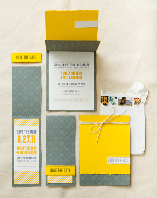


Paper Bag Invites. All rights reserved.